Visual decisions grounded in your audience and offer.
02 / Produce
A connected identity
Logo, type, colour and graphics designed to work together.
03 / Learn
Ready to apply
Guidelines and assets your team can actually use.
Why consistency matters
A logo is a starting point. A system makes it useful.
When every channel looks like a different business, your message loses coherence. A logo without a working identity system leaves teams improvising colours, layouts and assets at every launch.
We translate your positioning into an original visual language and practical rules your team can use. Discovery, identity design and priority applications are scoped together so the result works beyond the presentation deck.
Your next stage shapes the identity.
A new launch, an established brand refresh and a consistency programme need different levels of change. We agree what should evolve, what should stay recognisable and which applications matter first.
What the work includes
Six foundations of a usable brand identity.
The proposal defines creative routes, applications, revisions and handover. Each workstream ends with a practical output.
01
Discovery & design brief
Define what the identity needs to express and where it needs to work.
Audience, offer and positioning inputs
Current brand and competitor visual review
Priority touchpoints and stakeholder alignment
What you receive
An agreed design brief and application priorities.
02
Original visual direction
Explore distinct creative routes grounded in the brief.
Moodboards and visual territories
Design rationale beyond personal preference
Agreed concept routes and review checkpoints
What you receive
An approved direction with a clear rationale.
03
Logo & mark system
Create a practical identity mark for real-world use.
Primary, secondary and compact variations as scoped
Small-scale, one-colour and reversed use checks
Clear space and minimum-size guidance
What you receive
Approved logo kit with agreed vector and digital exports.
04
Colour, type & graphic language
Build the visual vocabulary around the logo.
Colour roles and suitable text/background combinations
Typography hierarchy and licensing requirements
Imagery direction, graphic elements and layout rules
What you receive
A documented visual system for agreed touchpoints.
05
Guidelines & practical templates
Give your team rules they can apply consistently.
Logo, colour, typography and imagery guidance
Agreed social, presentation or campaign templates
Usage examples and common mistakes to avoid
What you receive
A usable brand guide and scoped editable templates.
06
Rollout & handover
Move from approved design to organised implementation.
Asset naming, file formats and licence notes
Priority touchpoint checklist and implementation owners
Handover review with your marketing or web team
What you receive
An organised file library and rollout checklist.
Your main goal
What does your brand need next?
Choose what matters most right now. It shapes the degree of change, design priorities and applications we plan first.
Launch a new brand
Start with a clear identity, not a collection of assets.
For a new company, product or offer that needs a distinctive, usable visual foundation.
Clarify the audience and positioning inputs
Develop an original logo and visual system
Prepare the priority launch applications
What we review
Fit against the design brief, usability across agreed applications and stakeholder approvals—not predicted market success.
The design process
From business context to a working identity.
Each stage has an approval point. One lead decision-maker and consolidated feedback keep design decisions clear.
01
Discover
Review your business, audience, current materials and priority applications. Agree scope and decision-makers.
Stage output
Design brief and project boundaries.
02
Explore
Present the agreed creative routes with rationale. Consolidate feedback and choose a direction before refinement.
Stage output
Approved visual direction.
03
Build
Refine the logo system, colours, type and graphic language. Test the identity on agreed real applications.
Stage output
Approved identity and application examples.
04
Equip
Prepare guidelines, exports and templates. Document third-party licences and organise the rollout handover.
Stage output
Brand toolkit and implementation checklist.
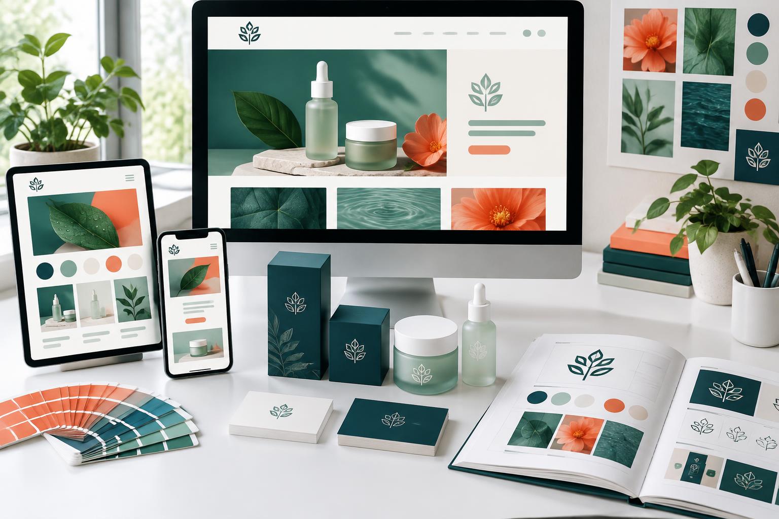
Illustrative concept imagery—not client work or a team photograph.
Designed for real use
One identity. Every important touchpoint.
A brand should feel connected on your website, a social post and a presentation without forcing every application into the same layout.
Recognition
Consistent marks, colour roles and typography help the identity stay coherent at different sizes.
Flexibility
A clear hierarchy and graphic language give your team room to adapt without losing the identity.
Implementation
Usable files, documented licences and application guidance make the handover practical.
Choose a sensible starting point
Support that fits your team's next step.
Build an identity, evolve an existing one, or equip your team with a usable toolkit. Fees are scoped to your requirements; no fixed price is published here.
Identity foundation
For new brands needing a clear visual starting point.
Discovery, original identity design, logo system and core guidelines.
Agree before starting
Concept routes, revisions, logo variations, file formats and launch priorities.
Brand refresh
For established businesses needing an evolution rather than a reset.
Existing identity review, scoped refinements and priority applications.
Agree before starting
Elements to retain, depth of change, stakeholder approvals and transition needs.
Guidelines & rollout toolkit
For teams with an identity that is difficult to apply consistently.
System documentation, scoped templates and organised asset handover.
Agree before starting
Template types, editable formats, application count and implementation responsibilities.
Final design ownership and editable-file handover are agreed in writing. Fonts, imagery, printing, web development and legal clearance are separate unless included. An enquiry is not an order or payment.
Quality you can review
Review the work against the brief.
Assess the design system, agreed applications and handover clearly. Customer perception and commercial outcomes need their own evidence.
Brand identity review measures and their interpretation limits
Signal
What we review
What it cannot prove
Brief alignment
Whether the approved direction addresses the audience, positioning inputs and agreed uses.
Stakeholder approval is not evidence of market preference or increased recognition.
Application consistency
Logo, type, colour and layout use across the agreed touchpoints.
A sample review does not cover every future campaign or asset.
Legibility & contrast
Selected text/background combinations and small-scale logo applications.
Checks are scoped and do not certify a website or product as fully accessible.
Handover readiness
Agreed files, guidelines, templates and licensing notes are available and usable.
Trademark clearance, printing and development are separate responsibilities unless scoped.
Audience feedback
Qualitative research findings if a research phase is separately agreed.
Small or unrepresentative samples cannot establish brand lift or causal revenue impact.
A new identity does not guarantee sales, recognition or trademark registration. Design reviews are not legal clearance or full accessibility certification. We document what was checked and what still needs specialist review.
Grounded in official guidance
Grounded in practical, documented guidance.
Official guidance on trademarks and accessible digital applications—not an endorsement of Slashside or a substitute for legal advice.
Trademark fundamentals
WIPO explains the purpose of trademarks and the distinction between an identity design and registered protection.